Before I attended this workshop, I hate remembering all the different names of fonts.
I found it interesting after today.
Typography is not only a letter, but also is art and technique of arranging type.
What I feel deeply from today's lesson is, typography is art,
we need to feel from our heart, each letter have their own style,
each curve and every single straight line is different.
Paul is doing a presentation about Typography.
The page he's showing us is what we should do in the next
 |
| " Why do we need the gap between words?" |
We are choosing a letter we are interesting, and present the letter into 7 effort.
This are the work from all the classmates.
Many people didn't finish coz of the limited time....Not a good excuse.><
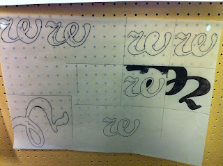
This is what I've done. I choose "w".
You can see I love how much I love curve.
Lots of my drawing filled with curve but no straight line.
This should be a disadvantage.
On the other hand, I found curves are beautiful, like silk and wave, etc.....
I realized that many girls chose the same"w"as me.
This the work from the other classmate. I like her Scale one which is the one on the left top.
Everyone try to make a big letter in Scale, but she just drew a small w in the big square.
From the first line, left to right.
Scale, Invert, Section, Layer, Outline, Deconstruct, Recompose
Look at the one in the right down conner. This is Recompose with w.
This is beautiful! The curve and tone recompose together, I still can reganise "w" letter.
Everyone is concentrating on the work.
This is my work
This is what we are doin next, put each word into different box.
The boxes are Texture, Colour, Scale, Composition, Repetition, Reduction, Order, Reflection.
Word " soft" in reduction.
Soft in repetition
soft in order. love this one
Can present the word for" order" very well. More like a drawing than someone really put soft in order.


No comments:
Post a Comment