Saturday, 30 October 2010

out and About


Paul lead us the engage with contemporary culture today near old street .
It is important to communicate with current artist through their work.

The session would lead us to the other way of thinking. 
Hopefully more idea can come into our brain explore our thinking.


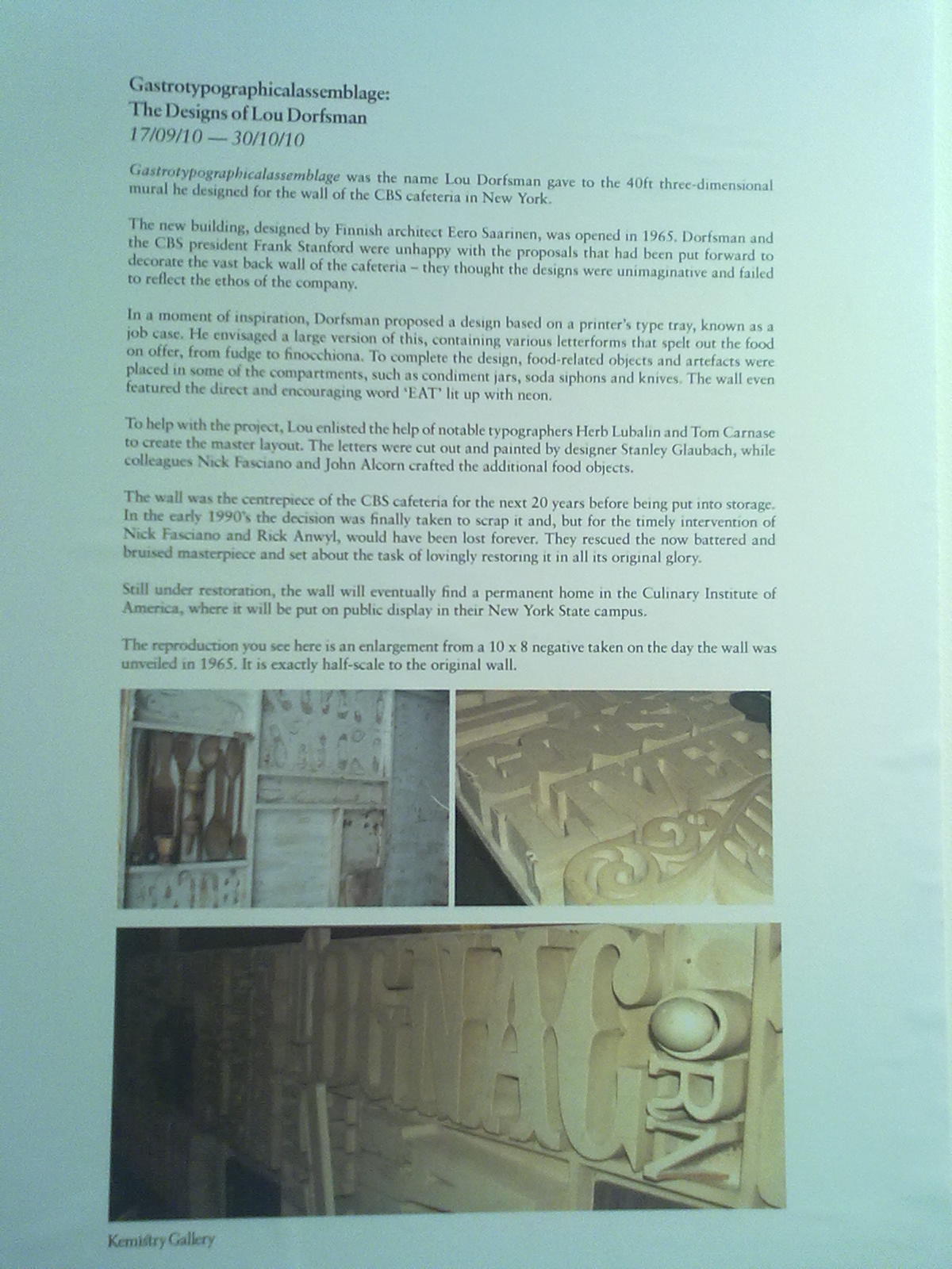
Here is the first place we went on the way out.(KEMISTRY)


You might not see the print very clearly,
The first feeling when I see this print is GRAND.


As I mentioned before that I love curves. 
Also the size of the letter is being well organized.
People can read it easily even you see a mess of letters.
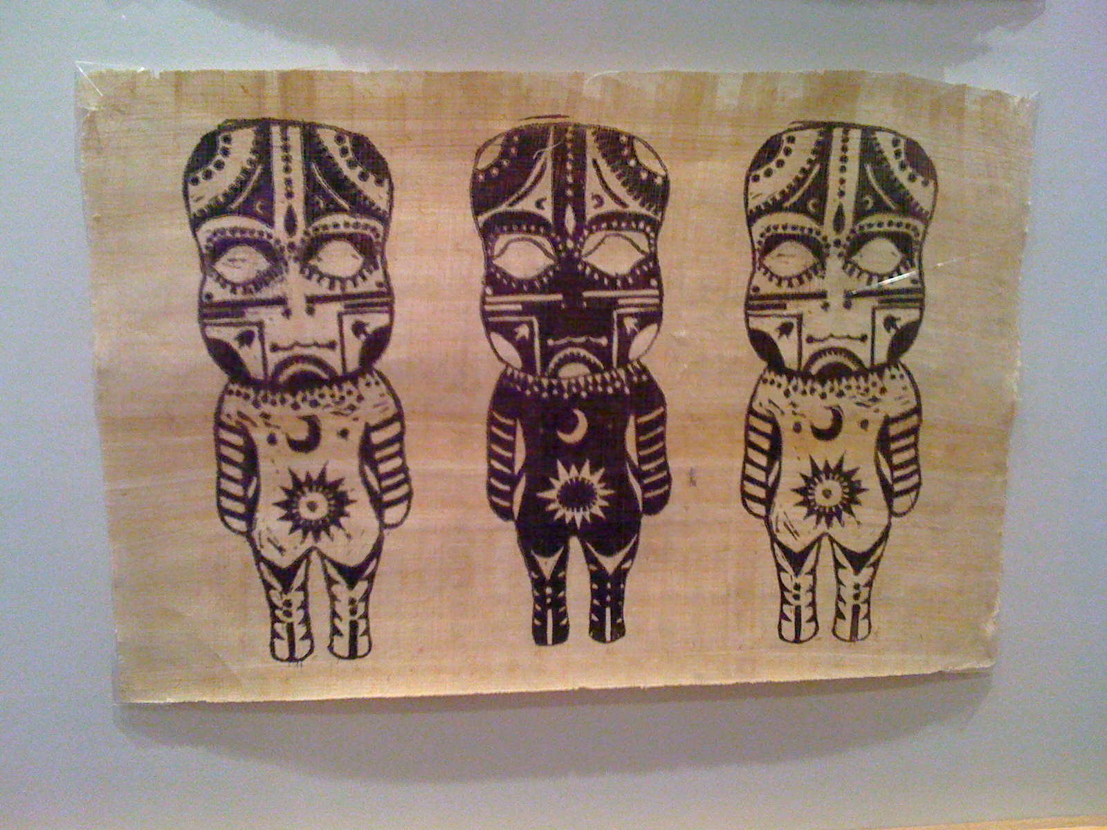
(Eat Drink and Be Merry)
Positive life attitude


Look at the poster, they could be couple or family.
The aim is being together.
I am so touching when I see this poster.
 I feel extremely warm whatever thinking about my family or my boyfriend


Here is the second place we went WHITE CUBE
Sadly we can not take any photo inside.
What they presenting is the work of letters printed layers by layers on the canvas.


Here is the little bookshop selling lots of contemporary artist's book.


Design for the light turning on

Drawing Workshop


Today's drawing lesson is different from the drawing lesson I attended before.
We need to use different ways to draw on object.
Open our mind draw, but not to draw what we see.
WHY?
The course we are doing is Graphic Design.
We should open our right brain as often as we can to think out more idea for Designing.


The draft for "designing" a leaf.
Lots of idea comes out from my mind.


Firstly, draw the object we chose. 
Everyone try to draw it looks like the same as the object.
Secondly, The teacher told us. 
THE KEY OF DRAWING IS: DO NOT LOOK AT THE PAPER WHEN YOU ARE DRAWING

I tried it before.....But I can't manage it after 5 mins.
The duck on the left page is drew without looking at the paper.
The duck bewteen two paper is drew by my LEFT hand.

I am not a left handed people. 
I understand both hand manage different things in our lift.
But our right brain is for the idea of design.
After the lesson, I try using my left hand to do something which I used to use my right hand to do.

Which is fun.


The original leaf.


The example how others draw the leaf in different ways.


My work

Fur Leaf.
Interesting


Using 3D to present.


I like this one. Just simple lines.


Saint Martin Exhibition


My friend Edmund took me and Lego to Exhibition today, where his friend had work in it.


These are the work has done by students.
Of course the teachers chose few amazing work to present in this exhibition


This is Print Making from Hennry. 
Love the detail and the design for the print.


Actually he made a story about the charter he produced.
Simple and lovely. 
This is the style I am interesting.
I understand how HARD to make a mode for print making,
especially harder to do the detail.
Love it!


Photogaphy


Illustration work- 4D game?


Friday, 29 October 2010

producing process

The process of producing a work-
This is what I learnt from today's workshop.
I worked with two groups today. One in the morning and One in the afternoon.
The pictures I am showing in below is the group I work with in the morning.


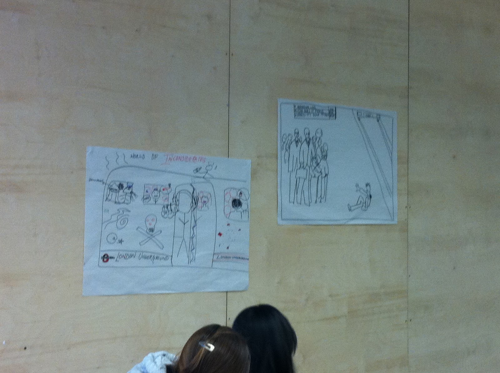
These two poster are other groups' work.
We are all doing the same project for Underground.


This the poster our group produced.
With baby idea. Keep the tube clean, make your next generation happy and enjoy the tube.


our group presenting the project.


This is the idea we wrote down follow by the brief.

This lesson impress me a lot. We've done three project today with the same process.
Each time we redo the process, we can feel we are getting into the process better.
We are faster and improving our idea better.
In the morning, tutor remind us the time very often,
but she gave us 1hour30min to finish the project by our group. 
We can follow the process quite well but didnt manage the time well.

Thursday, 28 October 2010

Typography Workshop

Before I attended this workshop, I hate remembering all the different names of fonts. 
I found it interesting after today.
Typography is not only a letter, but also is art and technique of arranging type.
 What I feel deeply from today's lesson is, typography is art,
we need to feel from our heart, each letter have their own style,
each curve and every single straight line is different.


Paul is doing a presentation about Typography.
 The page he's showing us is what we should do in the next


" Why do we need the gap between words?"


We are choosing a letter we are interesting, and present the letter into 7 effort.


This are the work from all the classmates.
Many people didn't finish coz of the limited time....Not a good excuse.><


This is what I've done. I choose "w". 
You can see I love how much I love curve. 
Lots of my drawing filled with curve but no straight line.
This should be a disadvantage.
On the other hand, I found curves are beautiful, like silk and wave, etc.....


I realized that many girls chose the same"w"as me.
This the work from the other classmate. I like her Scale one which is the one on the left top.
Everyone try to make a big letter in Scale, but she just drew a small w in the big square.


From the first line, left to right.
Scale, Invert, Section, Layer, Outline, Deconstruct, Recompose


Look at the one in the right down conner. This is Recompose with w. 
This is beautiful! The curve and tone recompose together, I still can reganise "w" letter.


Everyone is concentrating on the work.


This is my work

This is what we are doin next, put each word into different box.
The boxes are Texture, Colour, Scale, Composition, Repetition, Reduction, Order, Reflection.


 Word " soft" in reduction.


Soft in repetition


soft in order. love this one
Can present the word for" order" very well. More like a drawing than someone really put soft in order.